Safe Passage Visual Identity
On the eve of the Second World War, British communities put pressure on the government to help 10,000 kids escape Nazi Germany. I was commissioned by Safe Passage UK to design an identity for a campaign they were running on the 80th anniversary of this proud moment in British history, asking the Government to do the same again and resettle 10,000 child refugees over the next 10 years.
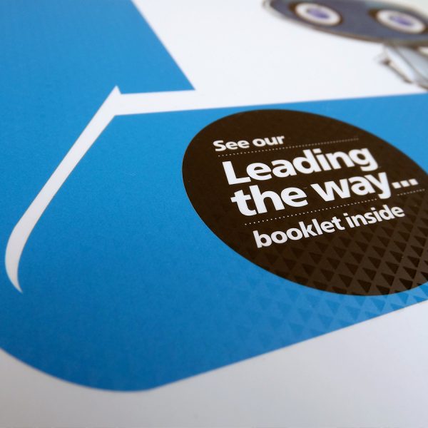
Despite the focus of the campaign being on World War Two, the look and feel of the new brand needed to be slick, crisp and modern. Our solution employed the red, white and blue of the Union Jack, but with a hand-made aesthetic, using graphic elements made of ‘tape’ to give a cohesive campaign language that nods to the DIY, grass-routes nature of the campaign.
Thanks to the hard work of Safe Passage campaigners, so far local councils have pledged 1,520 places for child refugees.
Client: Safe Passage UK


